Ballpoint blue
#244AA5Interaction, hover, selected choices, assessment links, navigation cues and active states.
oobCREATIVE brand & interface reference
The interface should feel human-made without making the page harder to read or use. Words stay live in the browser. Drawing adds character around the words.
Typography
The current site uses the browser-safe Arial, Helvetica, sans-serif stack. The personality comes from scale, spacing, linework, illustration and interaction—not generated lettering.
Go deeper.
Make the next step clear.
This paragraph, the headings above it and every CTA on this page are selectable, accessible browser text. Generated imagery does not carry interface copy.
Color roles
The palette works when color communicates behavior instead of decorating every surface.
#244AA5Interaction, hover, selected choices, assessment links, navigation cues and active states.
#E4572EHuman emphasis, recognition, important notes and restrained secondary signals. Not the default button color.
#F2C94CCallback, opportunity and strong next actions. Use black text for readable contrast.
Kinetic drawing system
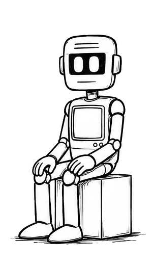
Use the canonical oobCREATIVE AI character as the recurring AI depiction. Keep black linework, reduced detail, generous white space and purposeful poses. The robot can point, think, explain, review or move through a process while the page copy remains live HTML.
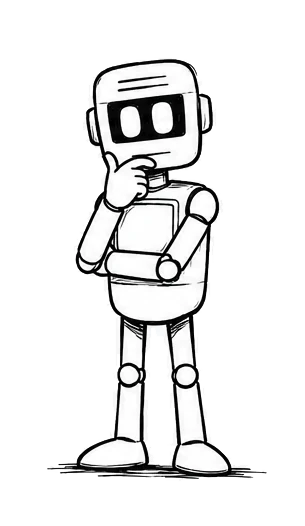
Thinking · evaluation and uncertainty
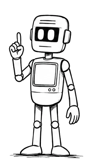
Pointing · guidance and next steps
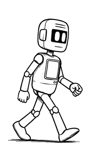
Walking · measured progress
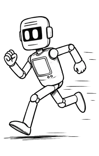
Running · momentum and implementation
Drawing boundary: generated or illustrated imagery may contain the robot, objects, arrows, marks and visual metaphors. It should not contain the headline, button copy, navigation labels or explanatory text the browser can render itself.
CTA system
These are working HTML/CSS patterns. The rough outline remains visible in the page. Ballpoint blue scribbles onto ordinary controls on hover or focus. Yellow identifies callback and strong-action moments.
01 · Simple button
Use one clear action when the visitor already understands the next step.
02 · Button + supporting text
The supporting line explains what happens without turning the button itself into a sentence.
03 · Split actions
04 · Icon + label links
05 · Card style
Useful when a CTA needs enough context to stand on its own as a small decision surface.
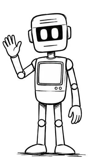
06 · Two-column CTA
Keep the illustration supportive. The actual action remains a real link.
07 · CTA with benefits
08 · Trust note + CTA
Free diagnostics should stand on their own even if the visitor never becomes a lead.
09 · Full-width strip
10 · Centered panel
Useful at the end of a section where the visitor has enough context to decide.
11 · Minimal inline CTA
When the context is already complete, the smallest useful CTA can be a text link.
12 · Callback / strong action
Warm yellow is reserved for a callback, opportunity or similarly strong next step—not ordinary navigation.
Crawl · Walk · Run
Use this as a pacing choice: understand first, make steady progress, or move into implementation. It is one relationship model expressed at three levels.
Assessment lockup
The character establishes the moment. The outline, label and arrow remain real interface elements.
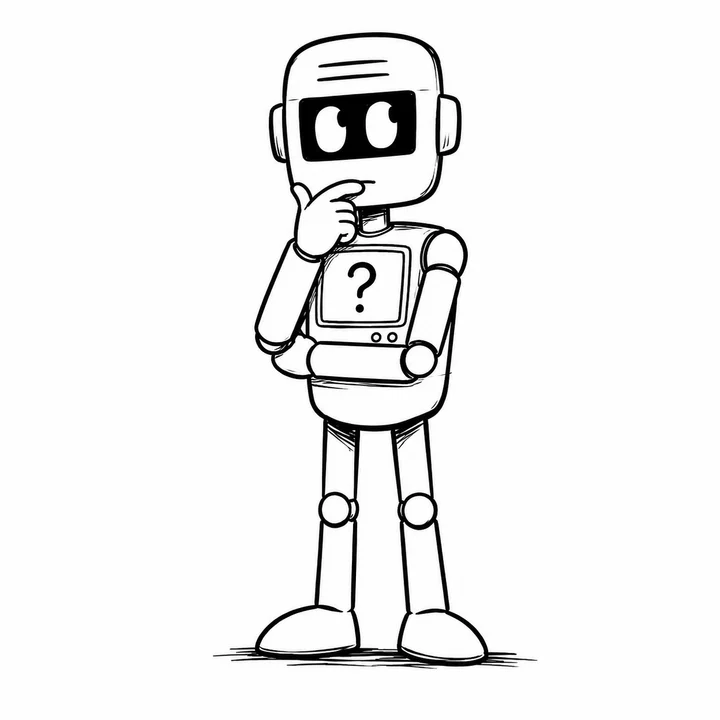 Take the oob AssessmentChoose the review that matches the decision in front of you.
Working page index
Use these links to review the shared page system and the industry-specific language, responsibilities and human boundaries.
Logo assets
Use the supplied production assets. Preserve aspect ratio and use the version intended for the background. Do not redraw, recolor, stretch or rebuild the mark from text.
Implementation rule
Hand-drawn character is a presentation layer. The underlying page keeps semantic HTML, keyboard focus, readable contrast, responsive layout and reduced-motion support.
The irregular border is part of the component style, not a screenshot. It should survive copy changes, responsive layouts and new CTA destinations.
The blue pen fill appears on hover, focus or selected state. Motion is restrained and removed when the visitor prefers reduced motion.
Blue communicates interaction, vermilion carries restrained human emphasis and yellow identifies the strongest action moments.
White space is part of the style. The doodle layer should clarify the focal idea rather than fill every open area.